Type Anatomy
[COURSE]
Type Anatomy
[YEAR]
Spring Semester 2016
MFA Graphic Design at AAU[INSTRUCTOR]
David Hake
[CATEGORIES]
Poster Series, Typography
[OBJECTIVE]
Learning and understanding every aspect of the anatomy of typography is essential. These advanced skills will enable to clearly communicate complex messages effectively with limited means, especially when the whole design only uses typography.
[APPROACH]
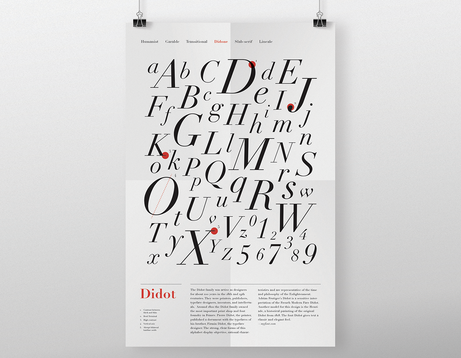
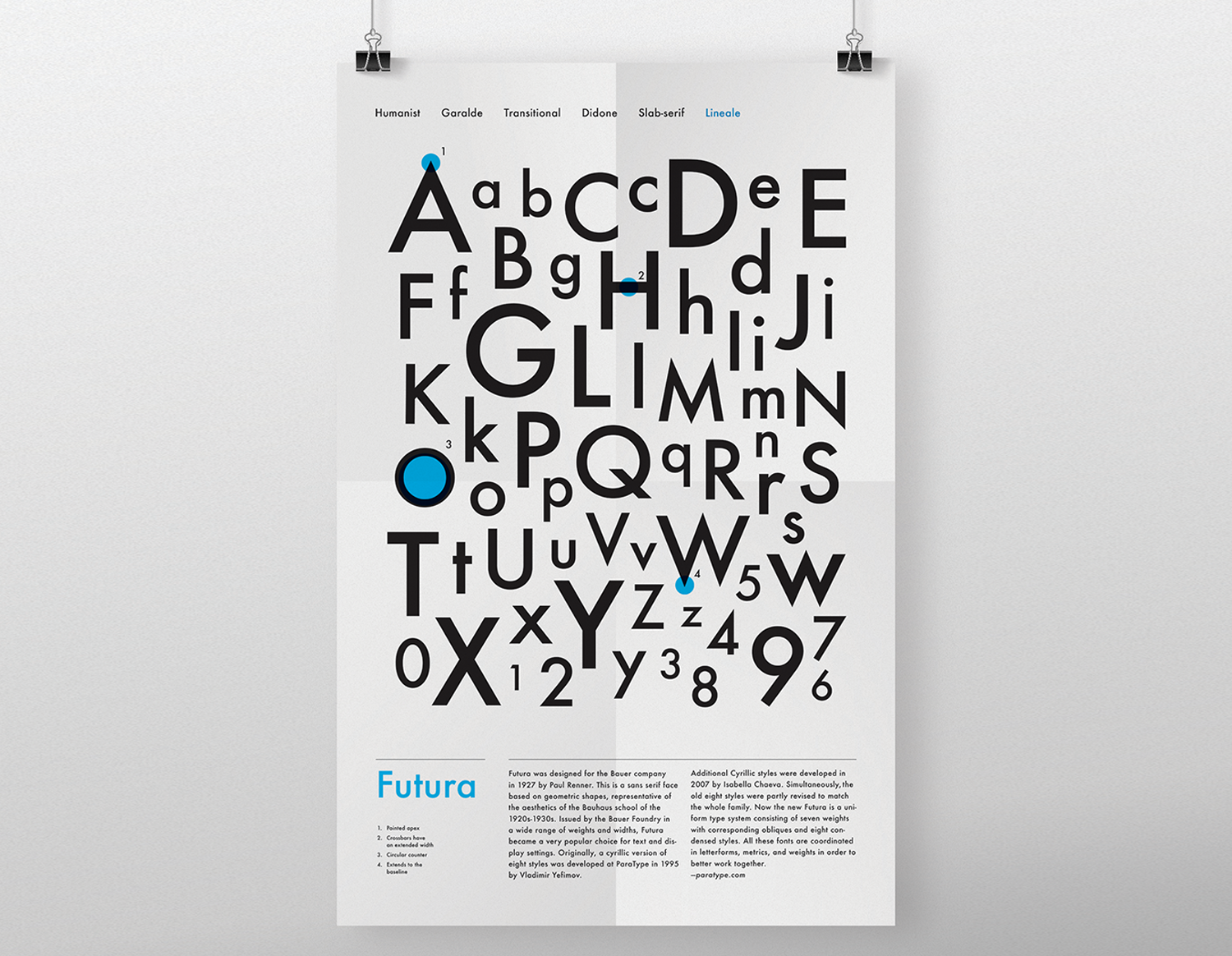
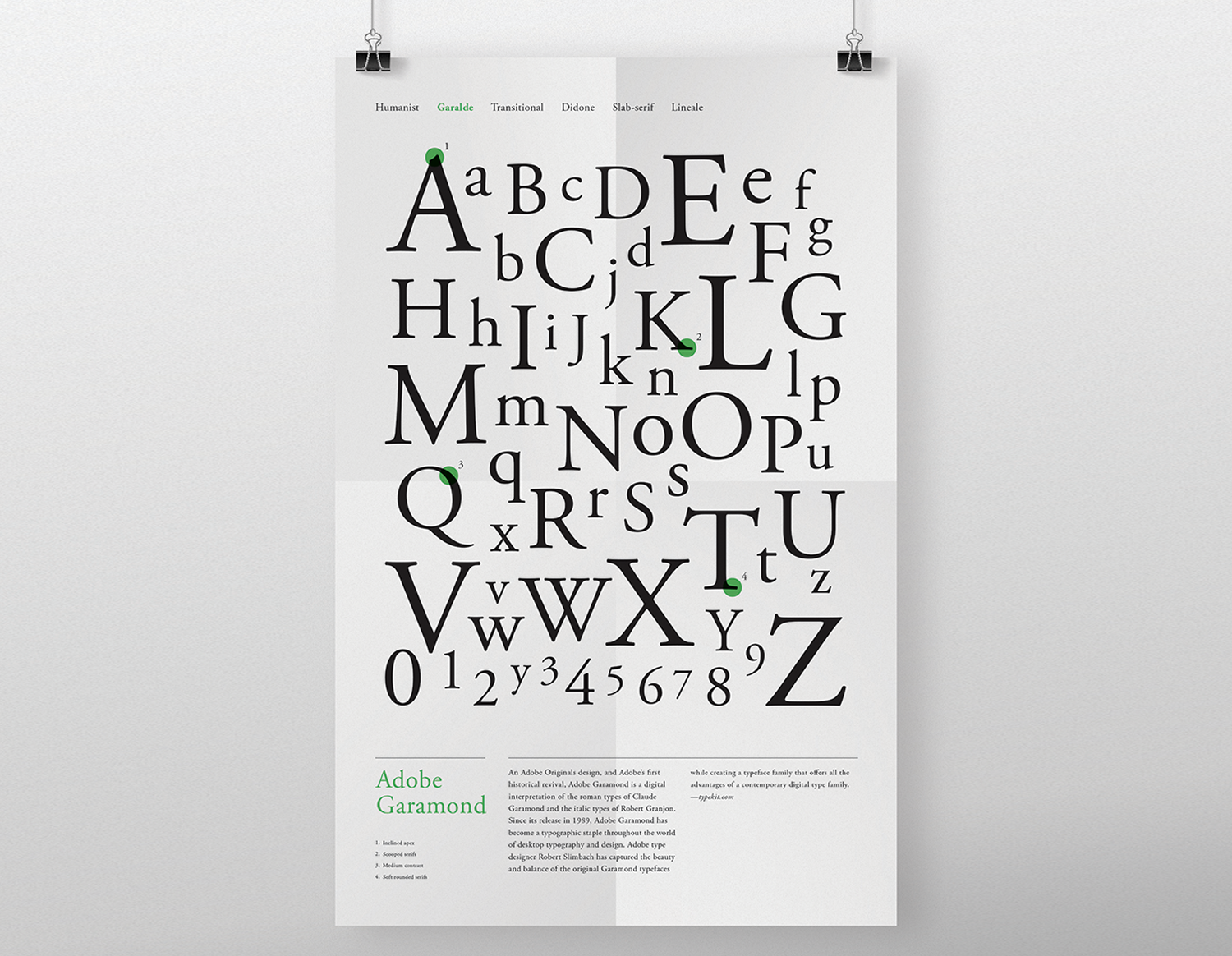
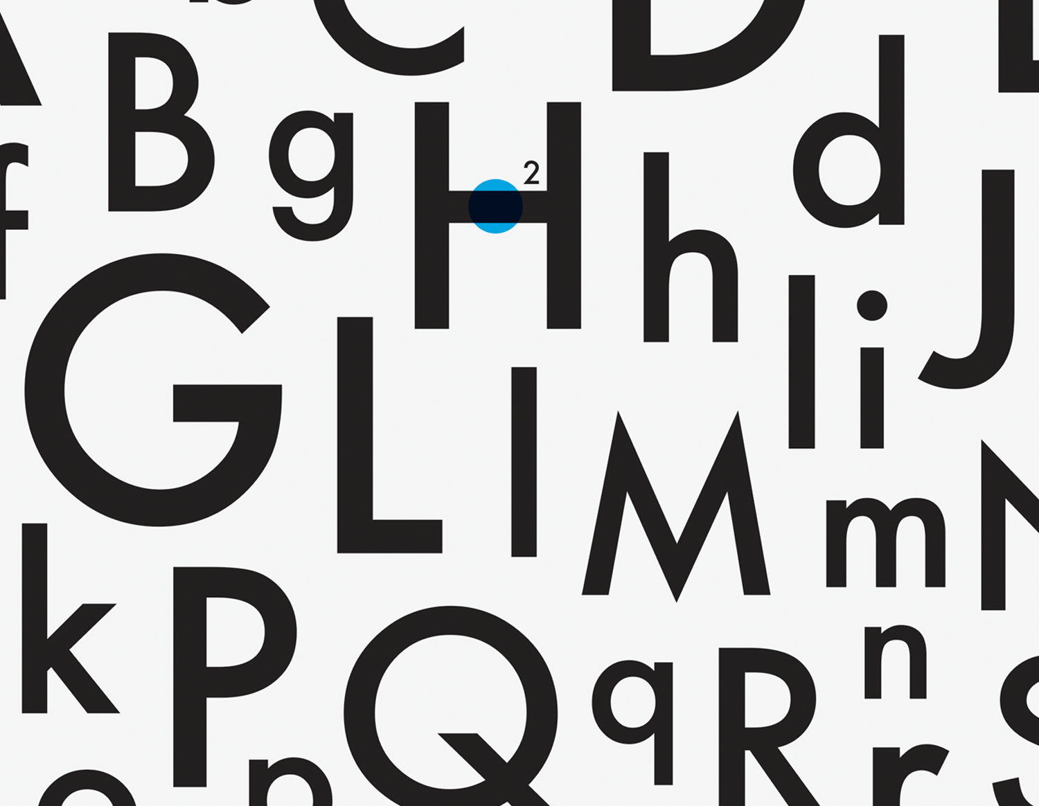
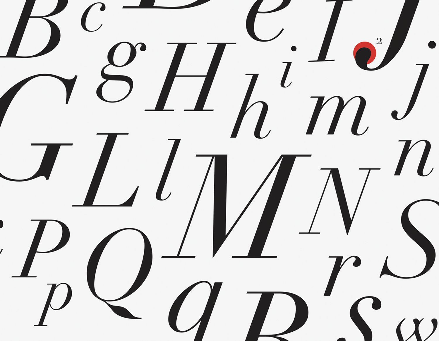
The purpose of this project was to make type anatomy posters. By making posters I learned type anatomy deeply. I chose three typefaces Didot, Futura, and Adobe Garamond. With these type fonts, I used three main colors which are blue, red, and green. In the poster, each type font’s alphabets are organized by size. It makes a big square shape which gives a stable feeling. I pointed to parts of the alphabet with a circle to identify the type anatomy.