Sarah’s Science
[COURSE]
Visual Literacy
[YEAR]
Fall Semester 2016
MFA Graphic Design at AAU
[INSTRUCTOR]
Hunter Wimmer
[CATEGORIES]
Brand Identity, Print Design, Book Design, UX/UI Design
[OBJECTIVE]
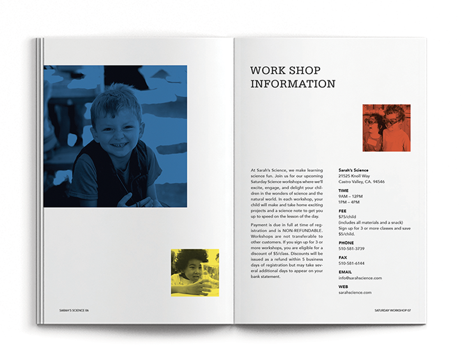
Sarah’s Science has offered science programs for children for 30 years. They continue to develop and shape their unique approach to stimulating children’s curiosity. However, their design system wasn’t enough to convey their great program well.
[APPROACH]
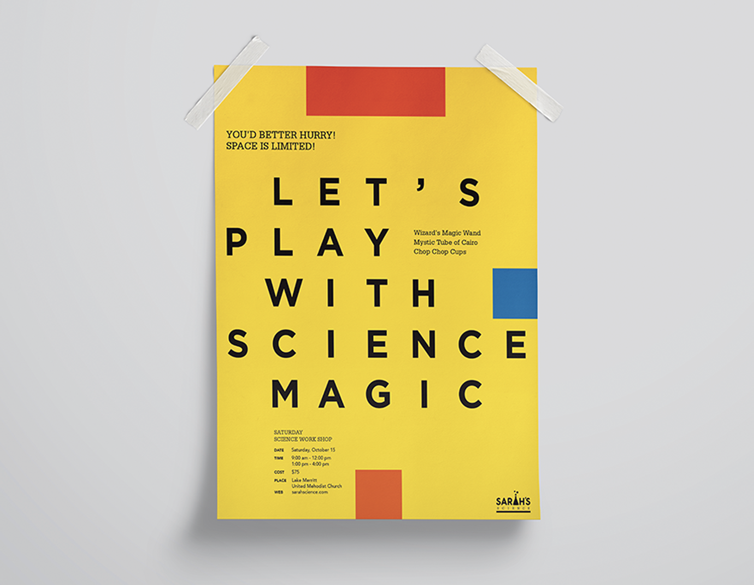
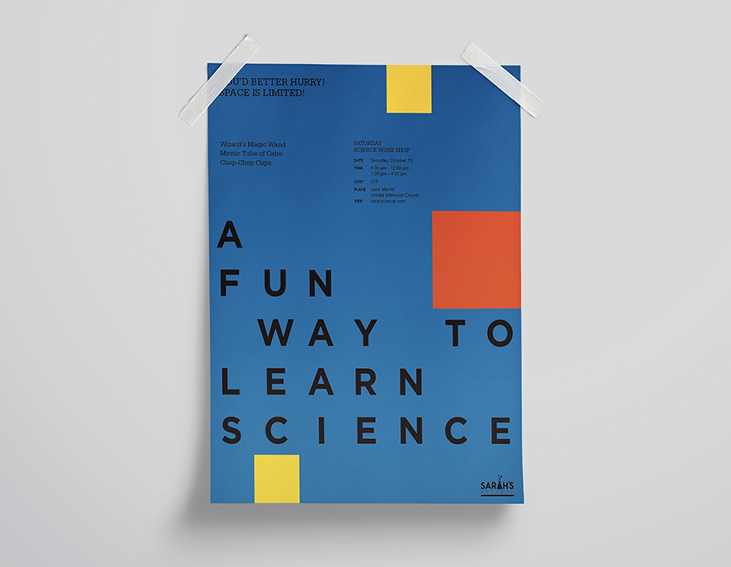
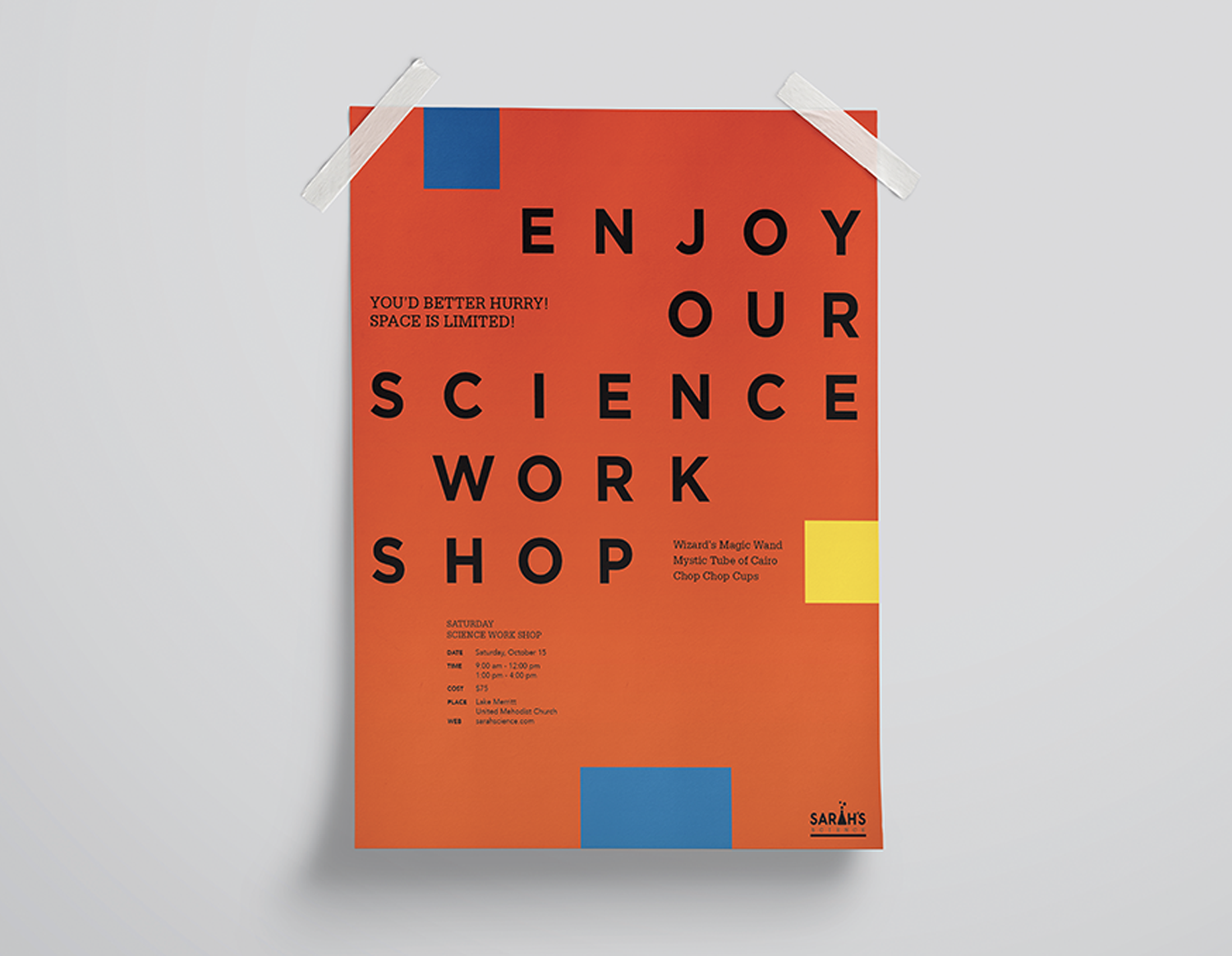
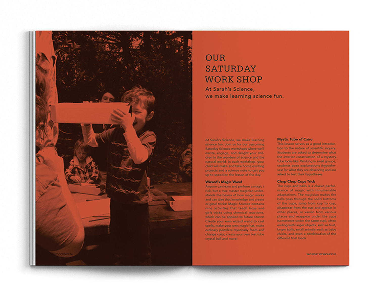
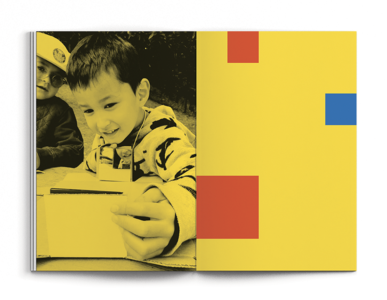
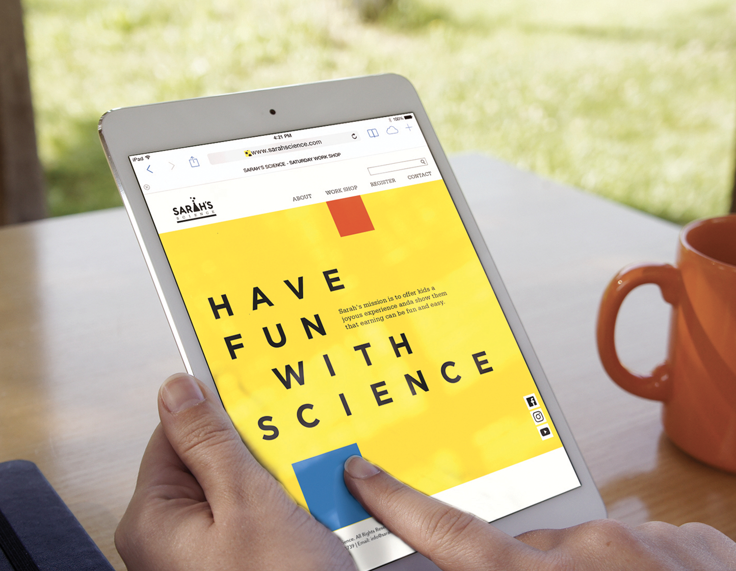
The purpose of this project was making a clear brand identity system for Sarah’s Science. In this process, I created an overall design system that included their graphic elements, typography, and image tone, and I also created more diverse deliverables such as a booklet, a poster series, and a website. I used yellow, blue, and orange, and I also used small square shapes. The overall brand identity has bright and active mood, and it represents the brand philosophy effectively.